
Purpose-Driven Design, Lasting Impact
We design spaces with purpose, built to endure the test of time. Whether a small tenant improvement or an expansive logistics center, every project is rooted in our mission to cultivate connection, support growth and leave a lasting impact. We are proud of our portfolio and the opportunity to bring our clients’ visions to life, creating spaces that will serve and inspire for years to come.
Blue Buffalo
Client: Blue Buffalo Company
Signage + Wayfinding | Environmental Graphics |
Branded Environments | Architecture
Navigating a Facility Built for Scale
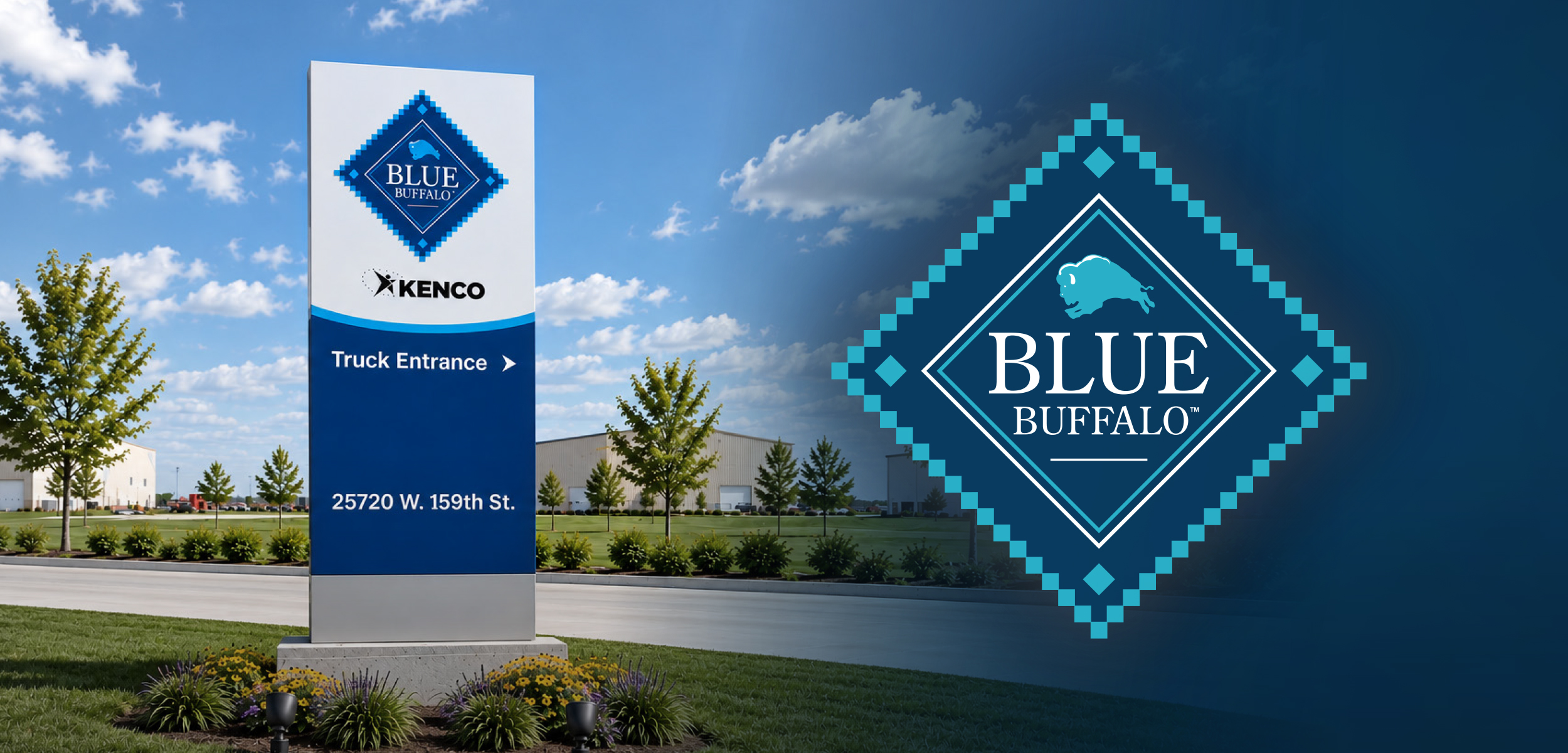
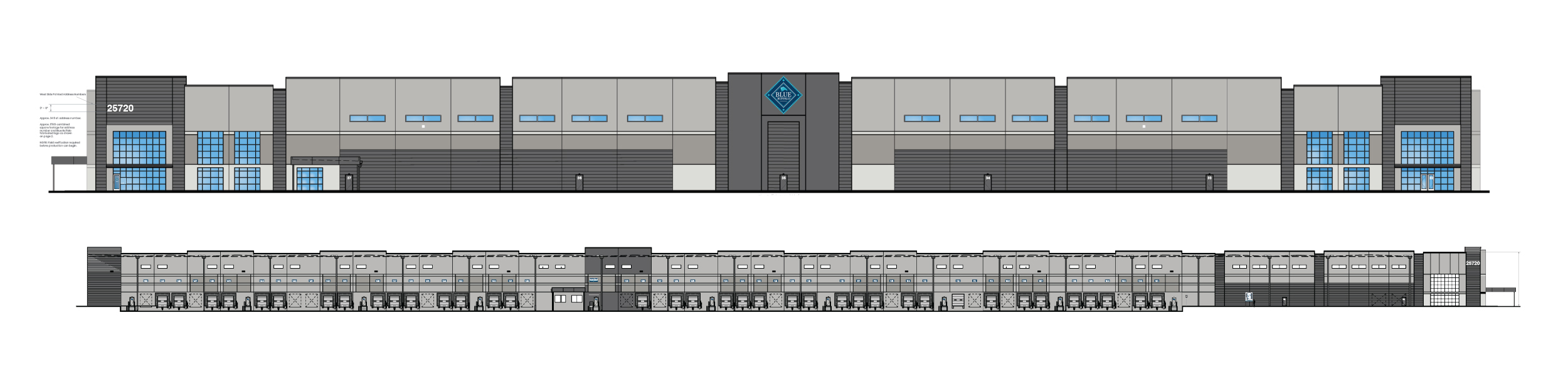
Gray’s Experiential Graphic Design (XGD) studio collaborated with its architecture team to develop a comprehensive signage, wayfinding and branded graphics package for Blue Buffalo’s new 727,350-square-foot distribution center in Olathe, Kansas. Designed to support large-scale logistics operations, the signage system prioritizes efficient truck circulation, clear navigation and brand visibility through roadside monuments, directional signage, loading dock identification and interior signage.
Making an Impression at Every Entrance
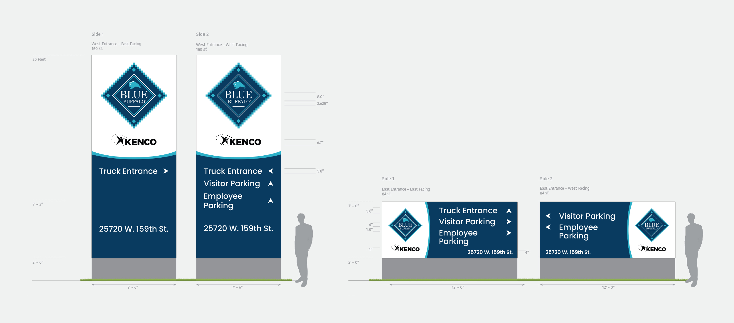
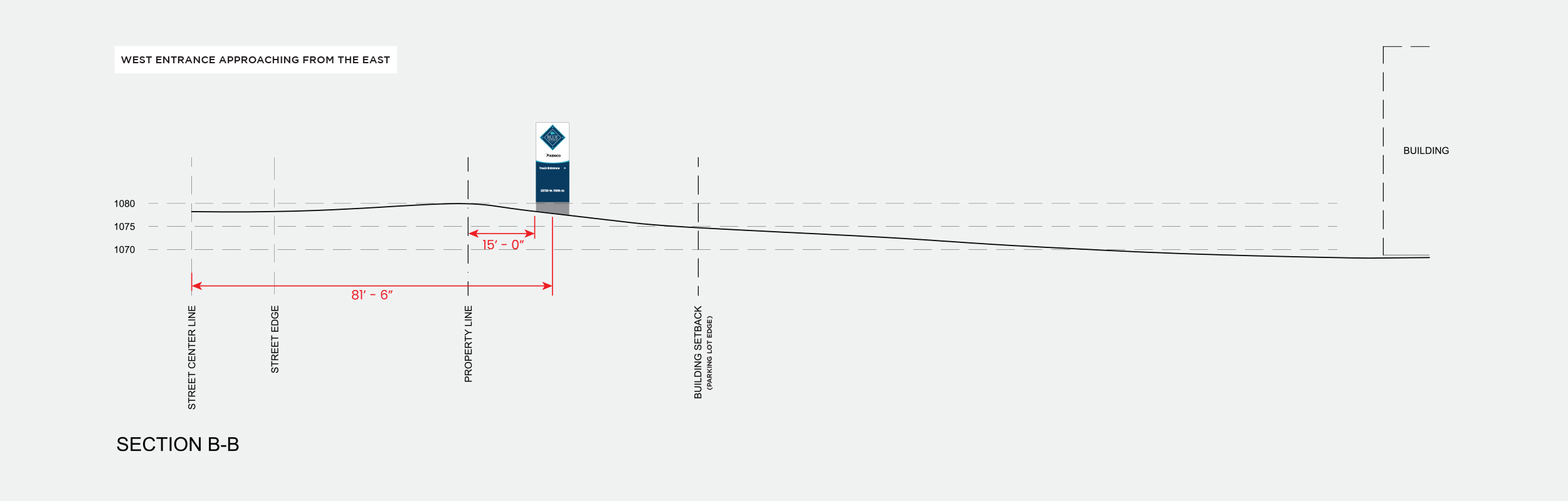
Two distinct monument sign designs establish a strong roadside brand presence while providing clear directional information for truck drivers, employees and visitors. Designed to balance scale, visibility and local sign square footage code requirements, each monument was carefully positioned in coordination with Gray’s architecture team, considering site grading and elevations to ensure optimal visibility.
Clear Direction from Arrival
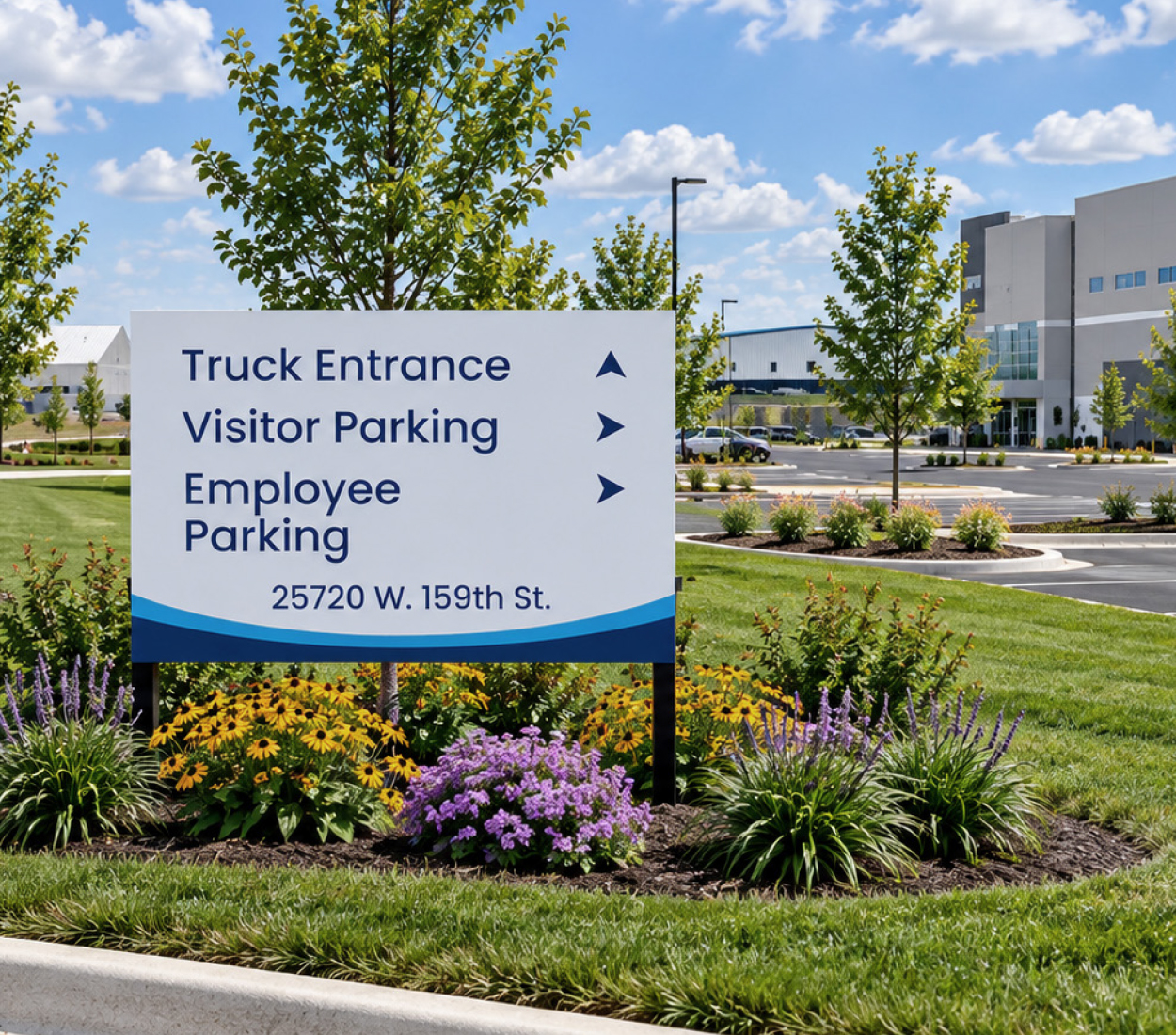
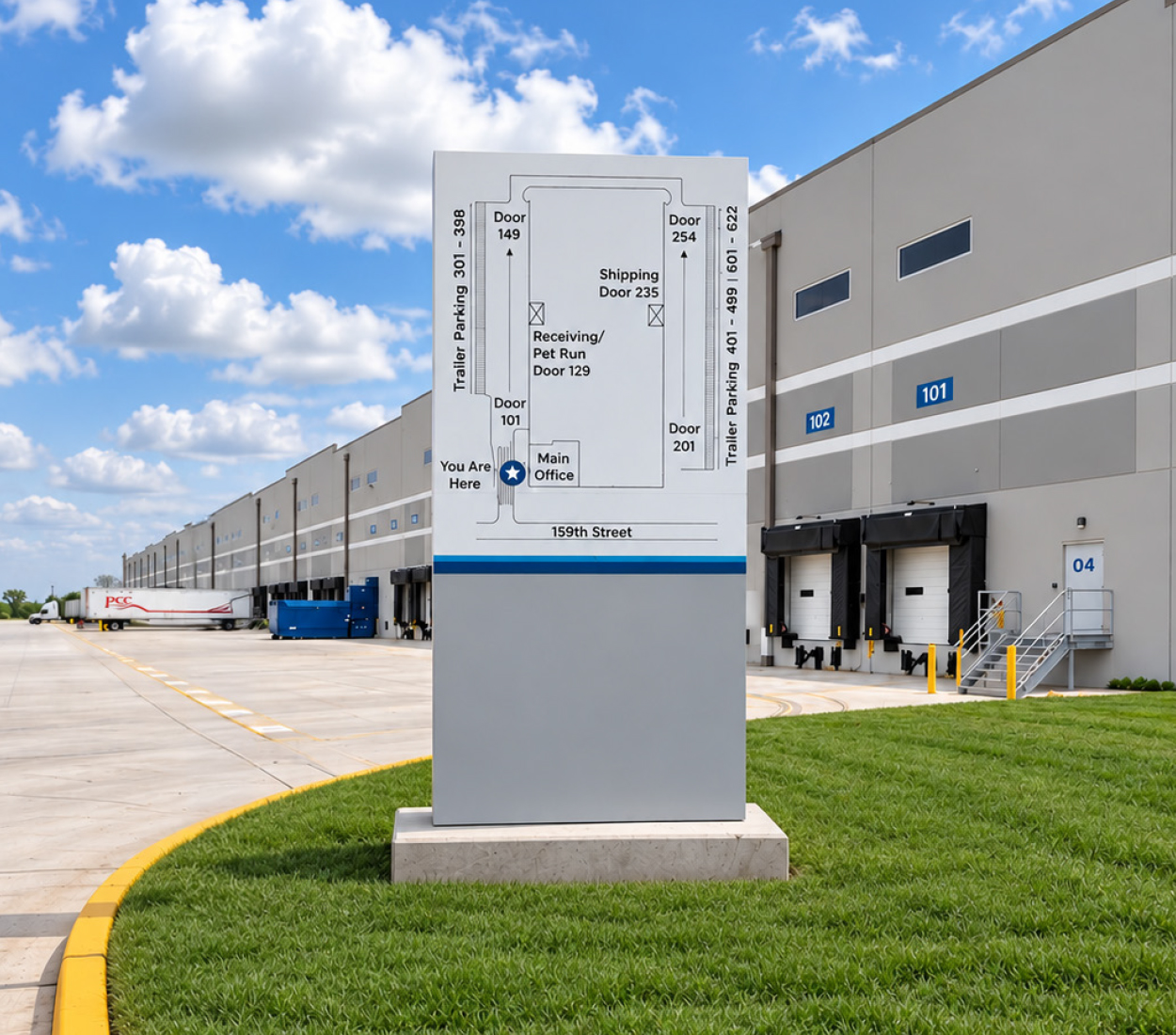
Strategically positioned directional signage guides visitors, employees and truck drivers to designated entrances and parking areas. Clear typography, recognizable branding and consistent visual elements simplify navigation while supporting safe, efficient movement throughout the expansive facility.
Designed for the Demands of Distribution
Efficient truck circulation was a primary design consideration for the distribution center. A facility map directs arriving drivers to designated loading docks, shipping and receiving areas, while prominent dock numbers, directional signage and Blue Buffalo branding provide clear visual reference points across the warehouse façades.
Consistency Throughout the Facility
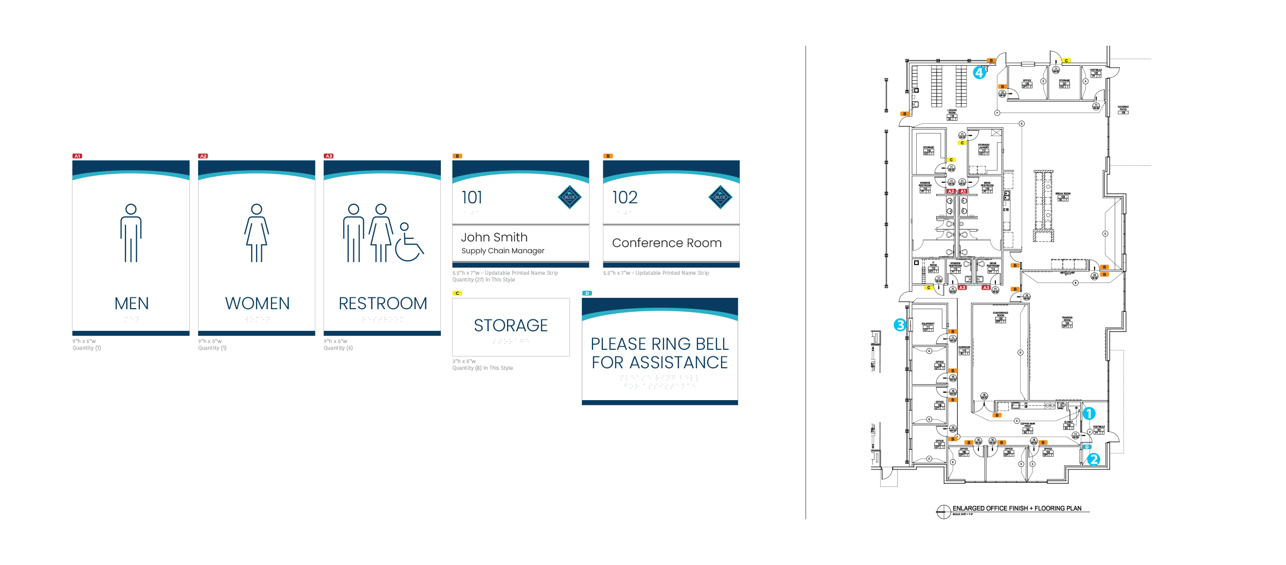
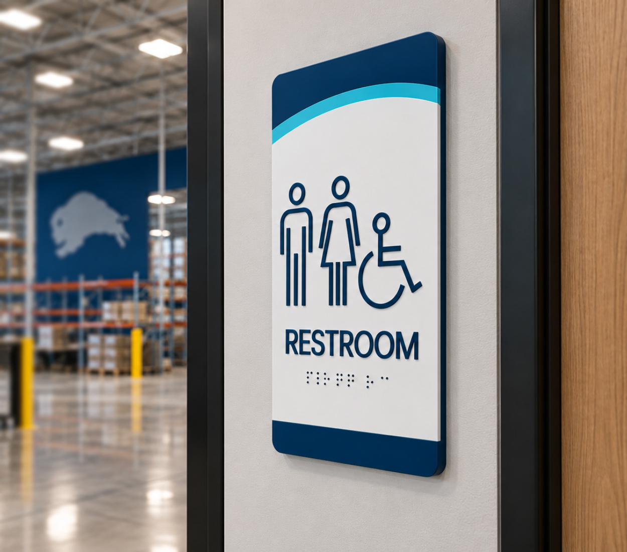
The interior signage program extends Blue Buffalo’s brand identity throughout the facility with a coordinated family of signs for offices, conference rooms, restrooms and support spaces. A detailed location plan identifies each sign type and placement, providing clear guidance for accurate fabrication and installation.
Designed for Flexibility and Function
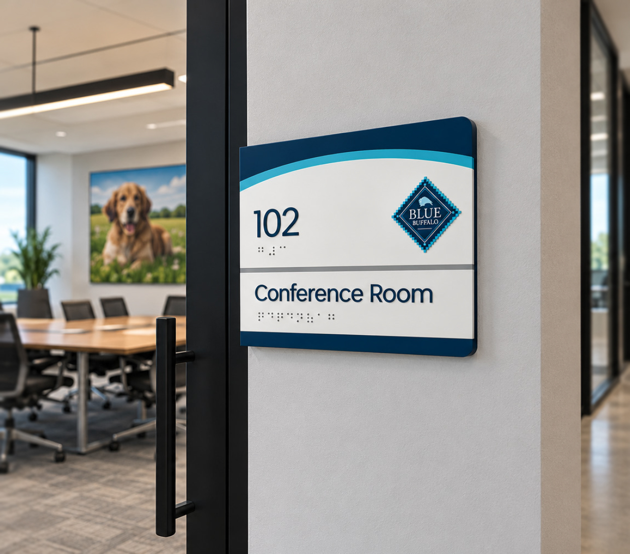
Layered painted acrylic, dimensional detailing and raised printing bring depth and refinement to the interior signage system. Incorporating updatable identification panels, the signs accommodate changing personnel and room functions while maintaining accessibility, durability and a consistent branded appearance.
Accessibility in Every Detail
ADA-compliant restroom signage combines recognizable pictograms, tactile lettering and Braille with layered acrylic construction and dimensional detailing. Thoughtful material selection, contrast and consistent styling ensure accessibility while reinforcing the overall signage design language.

Bringing Clarity to a Complex Environment
Through a comprehensive approach to signage, wayfinding and branded graphics, Gray created a cohesive visual system that responds to the scale and operational demands of Blue Buffalo’s distribution center. From directing truck traffic and identifying loading docks to guiding visitors and employees, the result is an integrated signage program that strengthens brand presence while improving navigation and operational efficiency.