Purpose-Driven Design, Lasting Impact
We design spaces with purpose, built to endure the test of time. Whether a small tenant improvement or an expansive logistics center, every project is rooted in our mission to cultivate connection, support growth and leave a lasting impact. We are proud of our portfolio and the opportunity to bring our clients’ visions to life, creating spaces that will serve and inspire for years to come.
Jacobsen Daniels
Client: Jacobsen Daniels
Brand Design + Development
Print | Website Design + Development

Overview
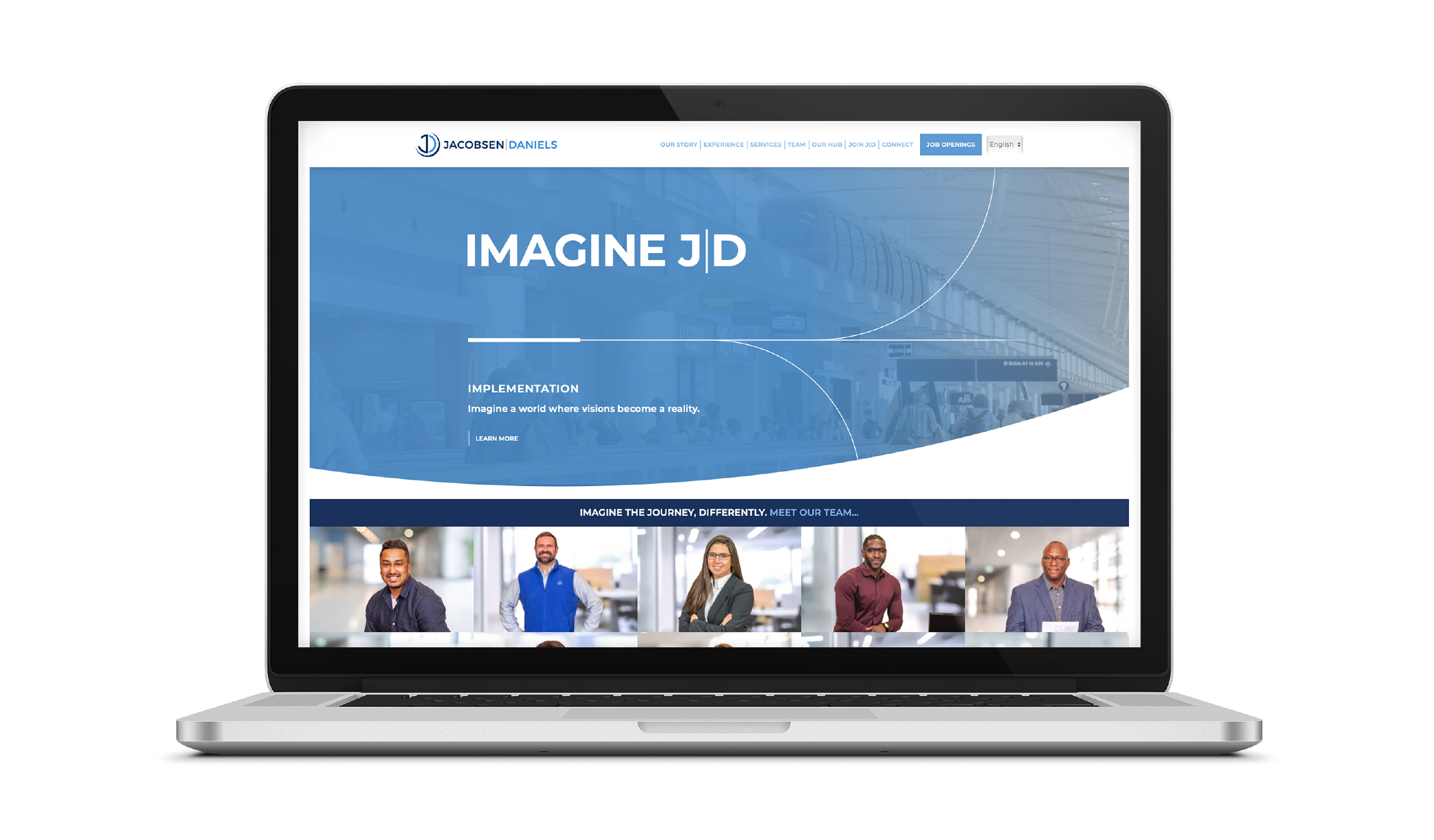
Jacobsen Daniels (J|D), a leader in the aviation industry, partnered with Gray to embark on a comprehensive rebranding effort. The goal was to authentically represent J|D’s core values and strengths, especially their commitment to diversity across disciplines, while enhancing the client experience. This rebranding project involved refining the logo, developing a cohesive brand identity, crafting targeted audience messaging and creating a new corporate website.
Former Brand
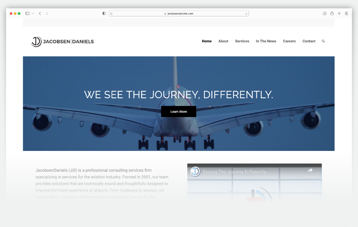
J|D’s previous website featured a grayscale color palette, dense text, and minimal imagery. Although it offered detailed service listings, it failed to fully represent J|D’s core values of diversity, innovation, and client-centric service. The tagline ‘We See the Journey, Differently’ suggested J|D’s offerings, but the site lacked a compelling visual representation of their mission, values, team and services.

Imagine J|D
To redefine the brand, Gray conducted extensive research, including interviews with key stakeholders and J|D’s leadership. This process led to the creation of the ‘Imagine J|D’ concept, which emphasizes innovation, creativity and problem-solving. This concept focuses on trust and connection by highlighting J|D’s mission, values, people and expertise. The updated tagline, ‘Imagine the Journey, Differently,’ reflects J|D’s forward-thinking vision while honoring their heritage.



Brand Components
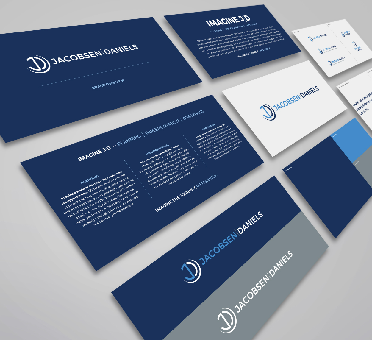
Gray incorporated curves into the overall design to complement J|D’s circular-centric logo, ensuring a cohesive visual identity. A graphic toolkit was developed for J|D’s in-house design team to use in future marketing efforts. The lines and curves in the design mimic aviation flight paths, symbolizing personalized journeys. The website’s narrative-driven content, combined with vibrant imagery, highlights the people behind J|D and tells compelling stories. Motion elements on the homepage evoke a sense of travel and movement, while the updated logo features a versatile font designed for adaptability across various platforms.

Summary
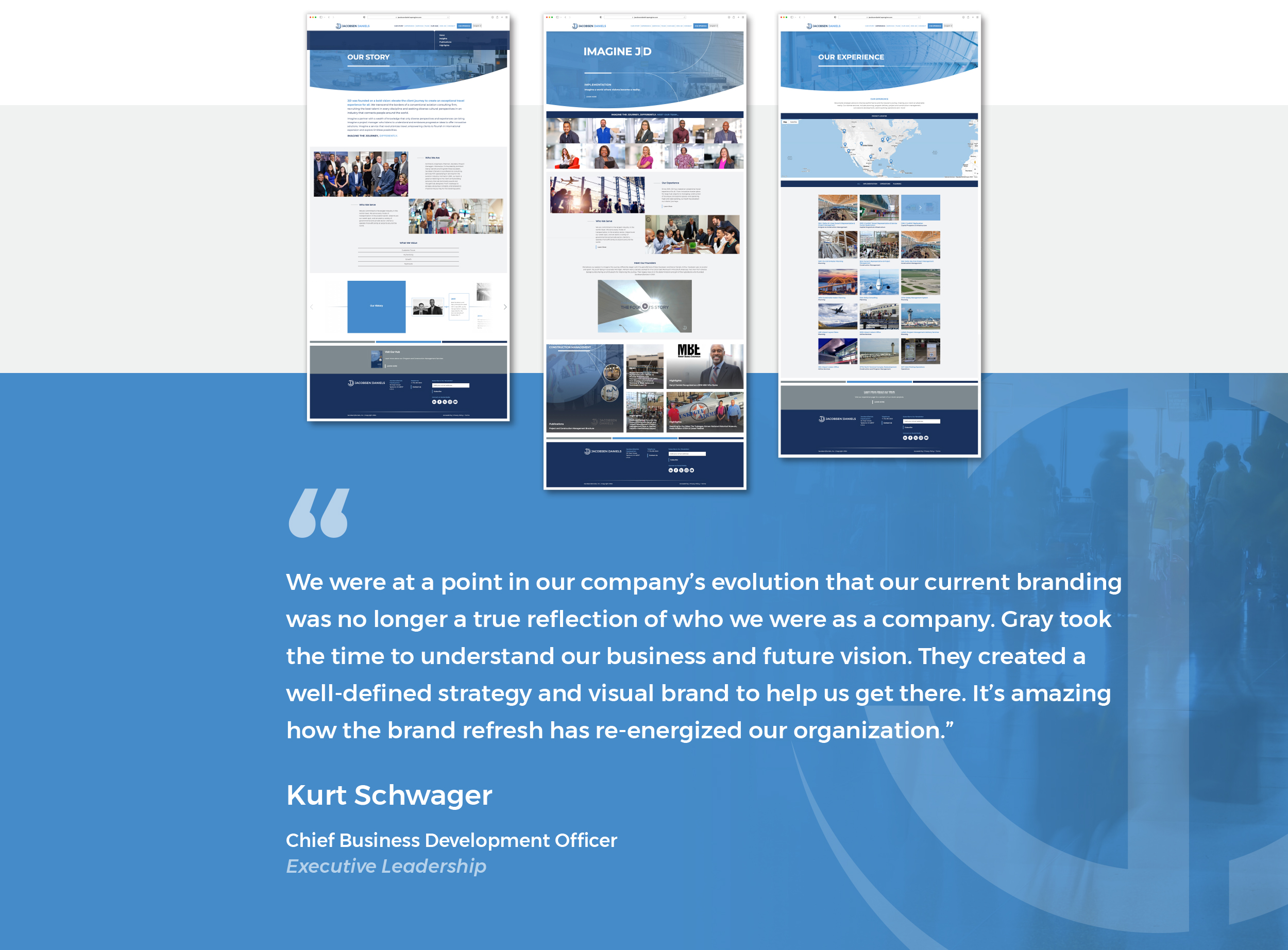
The rebranding of J|D immediately enhances the connection between the firm and its clients. By spotlighting diversity and offering easy access to team members, the brand becomes more engaging and approachable. Interactive elements, such as connectors at the end of each page and a sorting function, create a seamless user journey, guiding visitors to relevant project case studies. This significantly improves the user experience, making the brand more intuitive and informative.

